skincare
Skinfinity is a Croatian skincare brand that brings together science, nature and contemporary skincare.
Its product range combines carefully selected active ingredients with formulations developed to support skin health, hydration and regeneration.
skincare
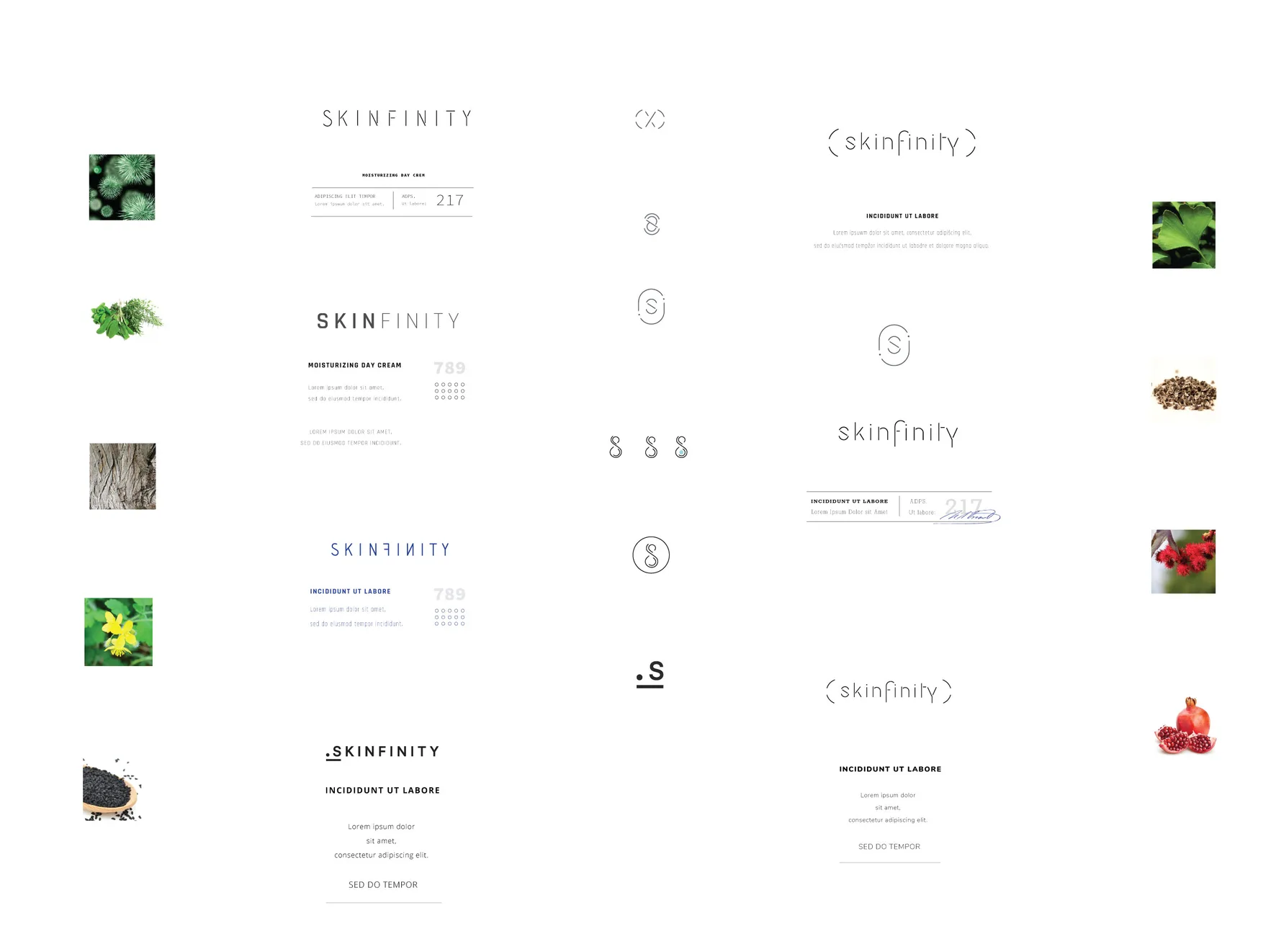
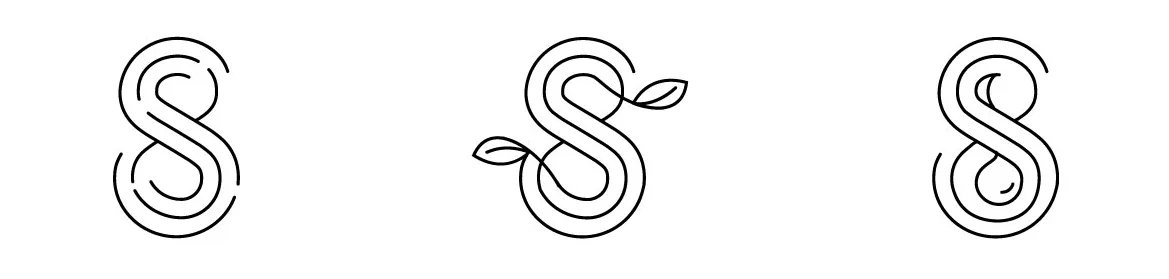
The identity began with a series of sketches exploring how a fingerprint, the letter S and the infinity sign could become one mark.
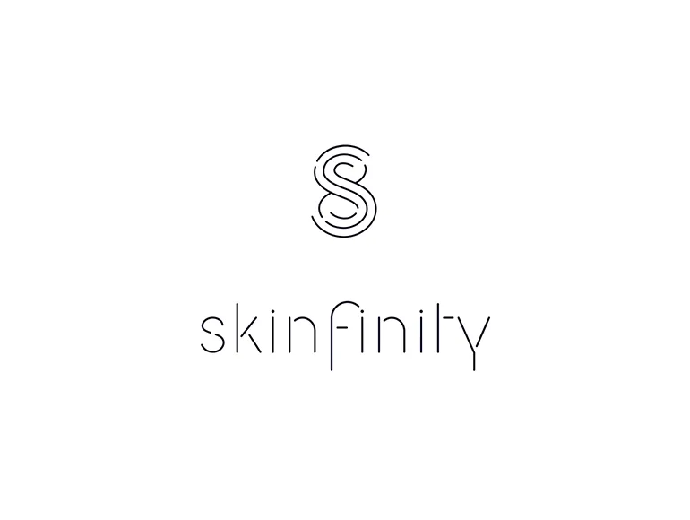
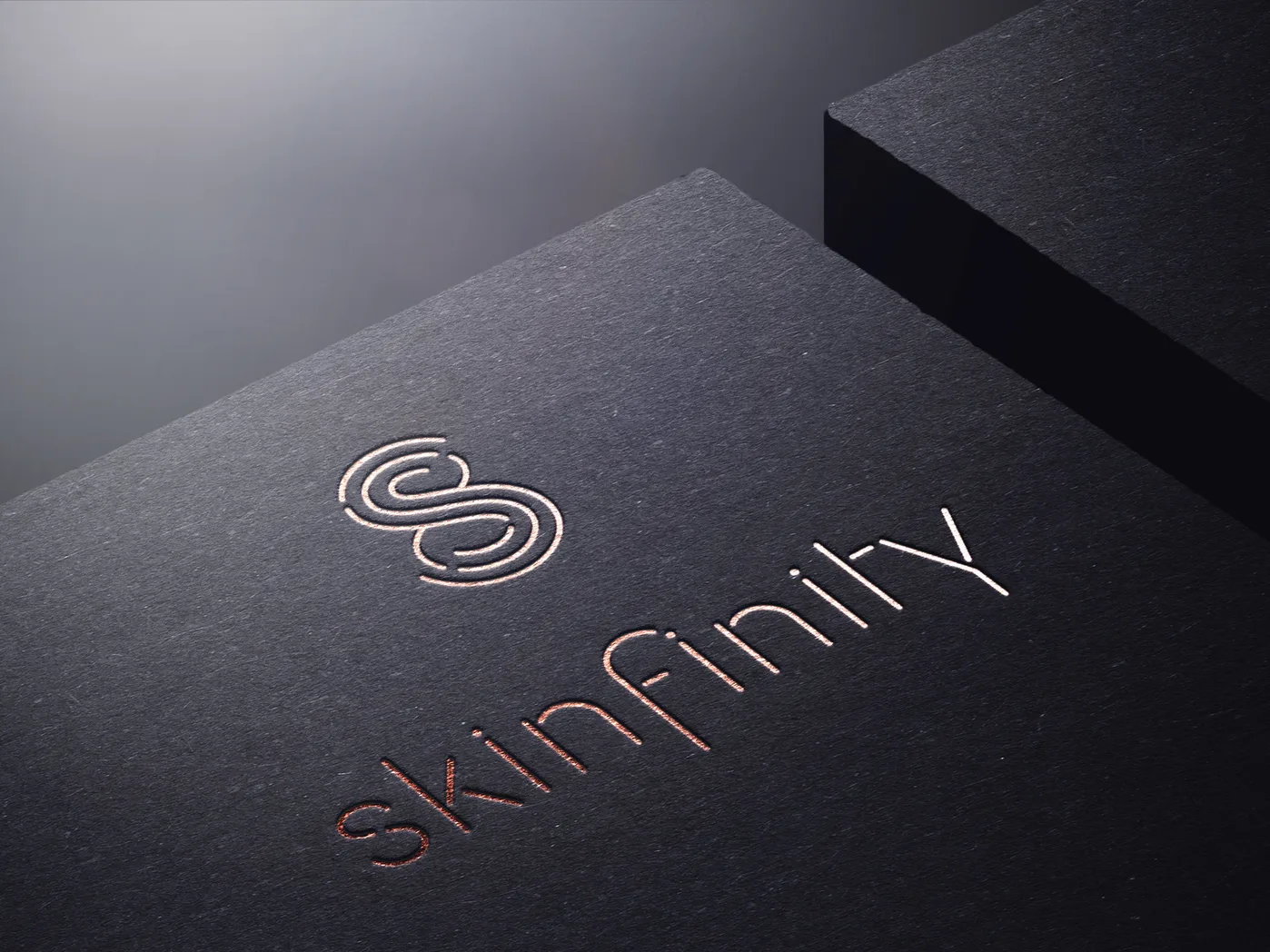
The final monogram is drawn as a single continuous line: light enough to sit quietly on the packaging, yet strong enough to stand on its own, printed, debossed into business cards or finished in rose gold.
Skinfinity's visual identity is built around a symbol that brings together three ideas: a fingerprint representing the brand's personalised approach to skincare, the letter S, and the infinity symbol, referencing longevity.
These elements come together in a delicate, continuous-line monogram that forms the centre of the identity. We carried the design across the packaging, pairing delicate custom created typography with soft colours and rose gold finishes.
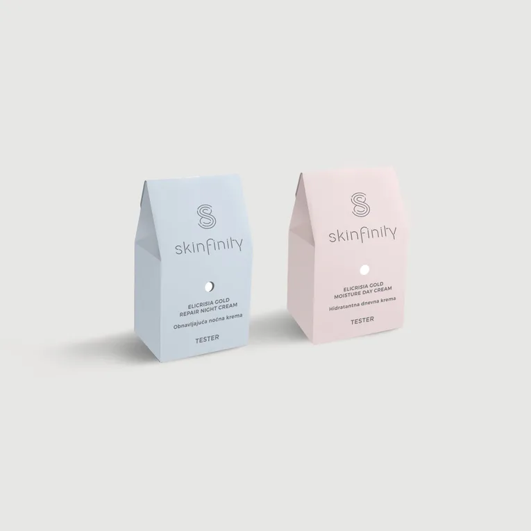
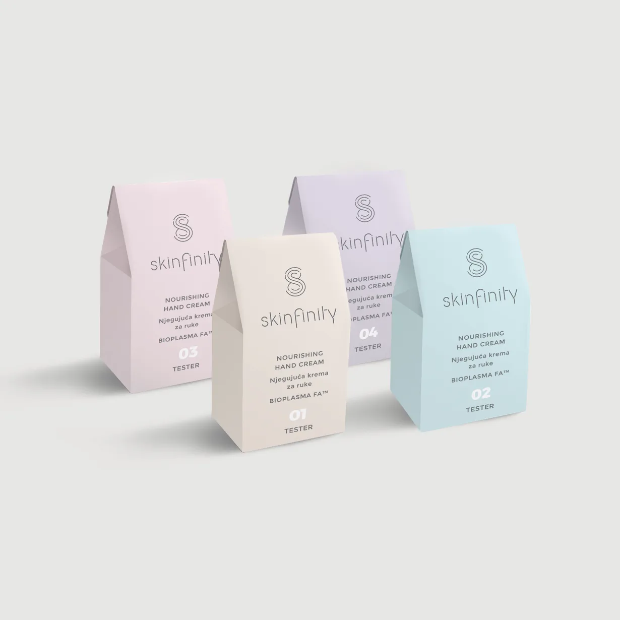
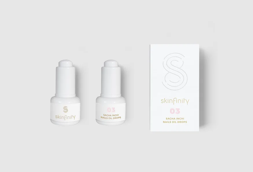
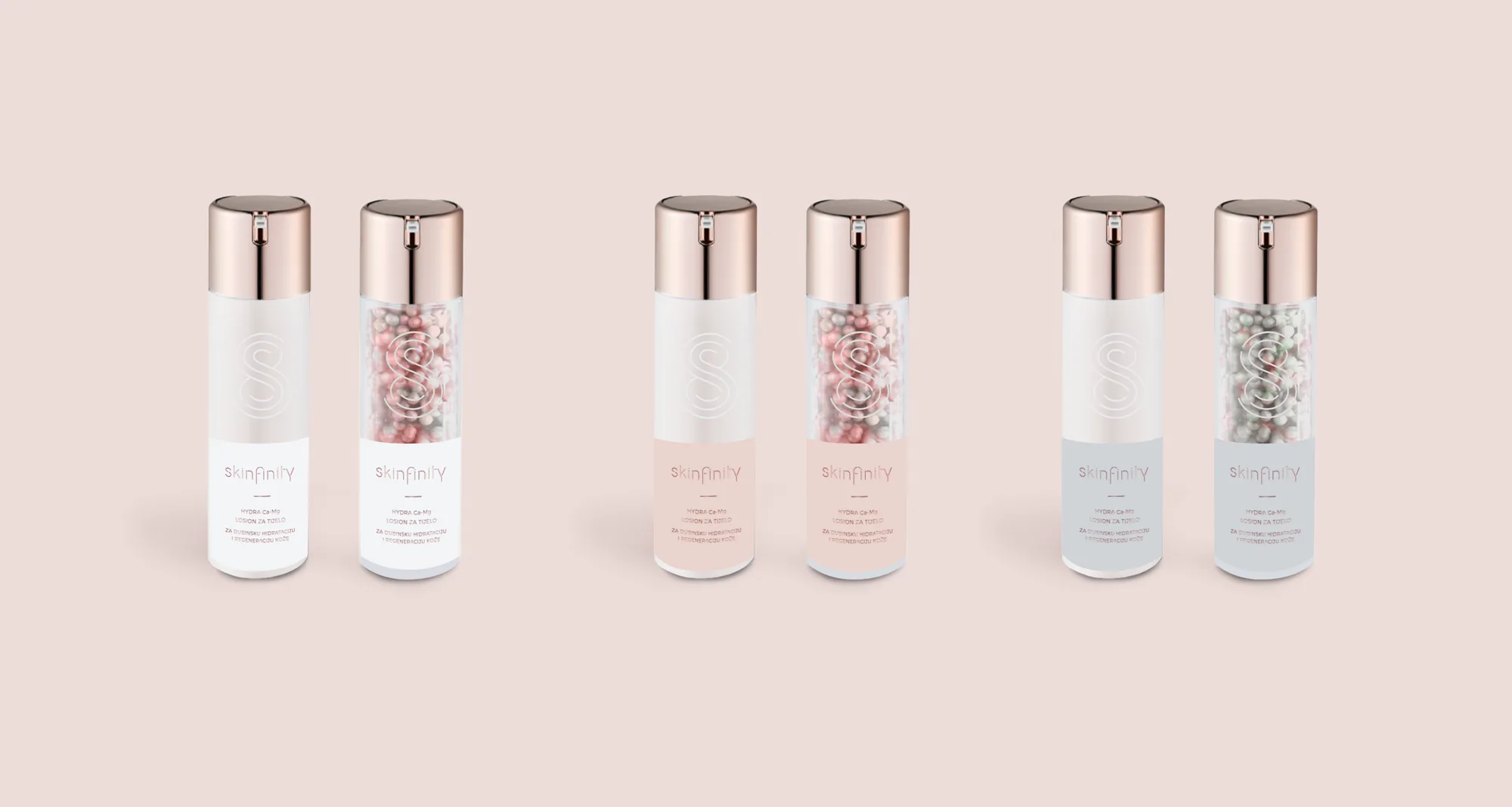
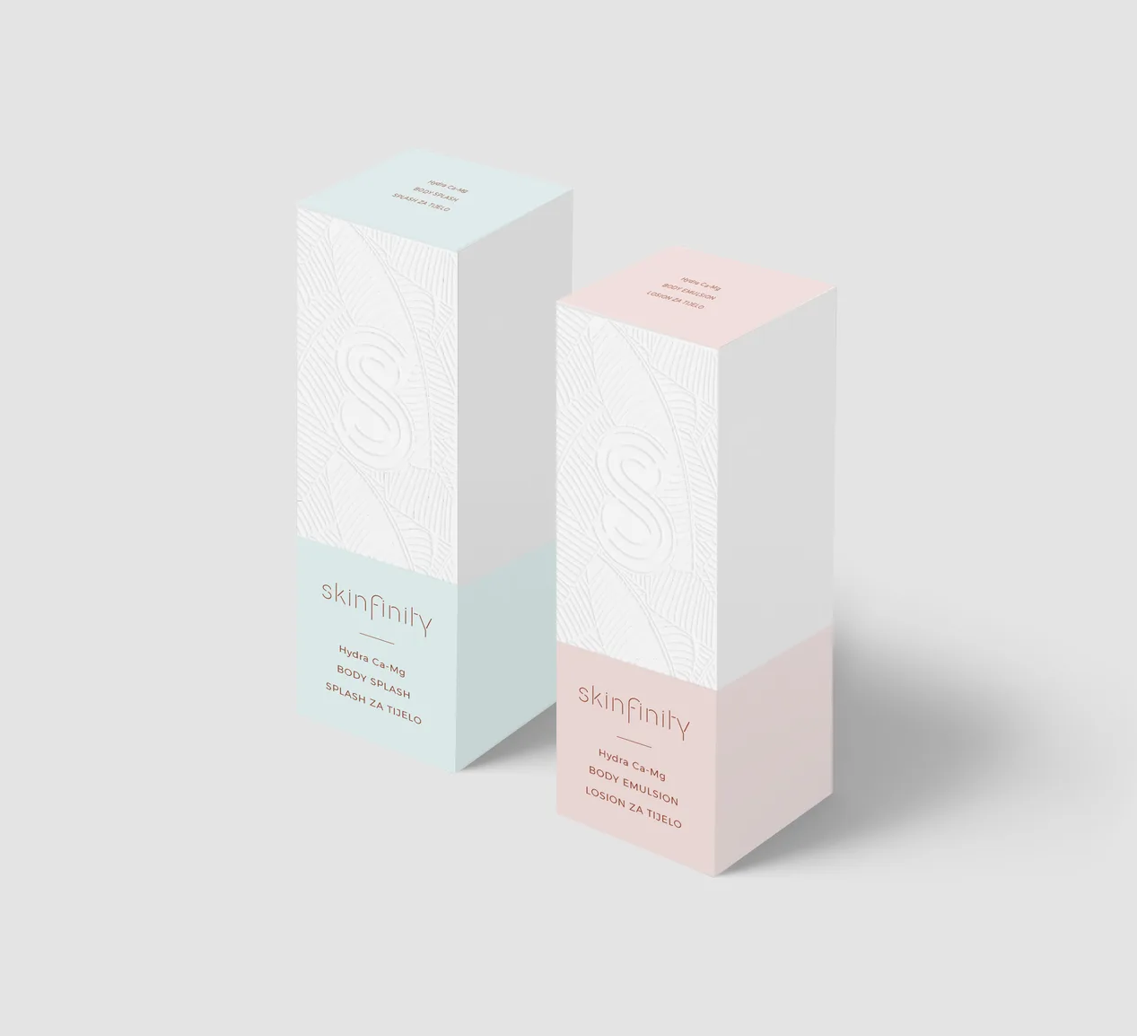
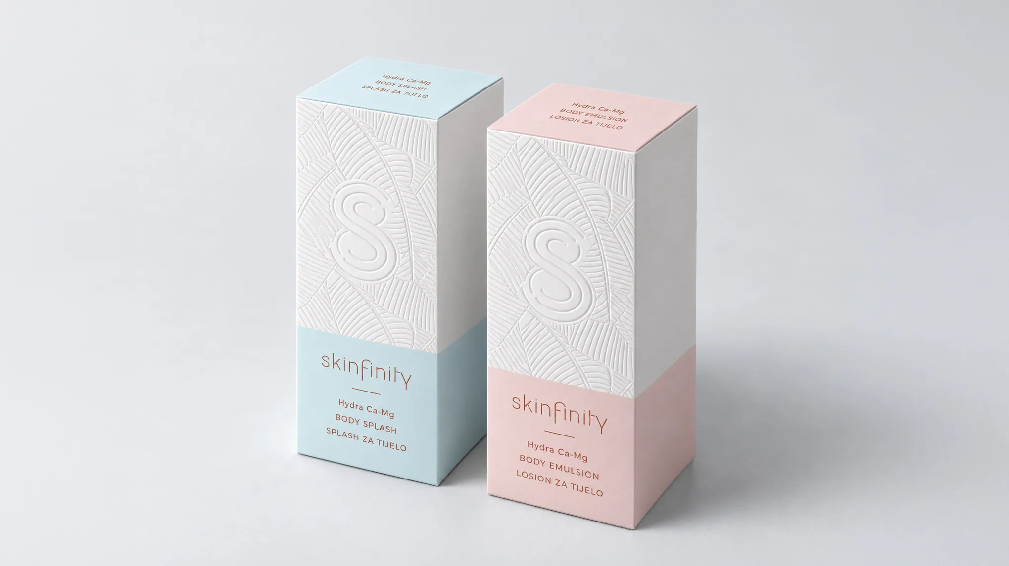
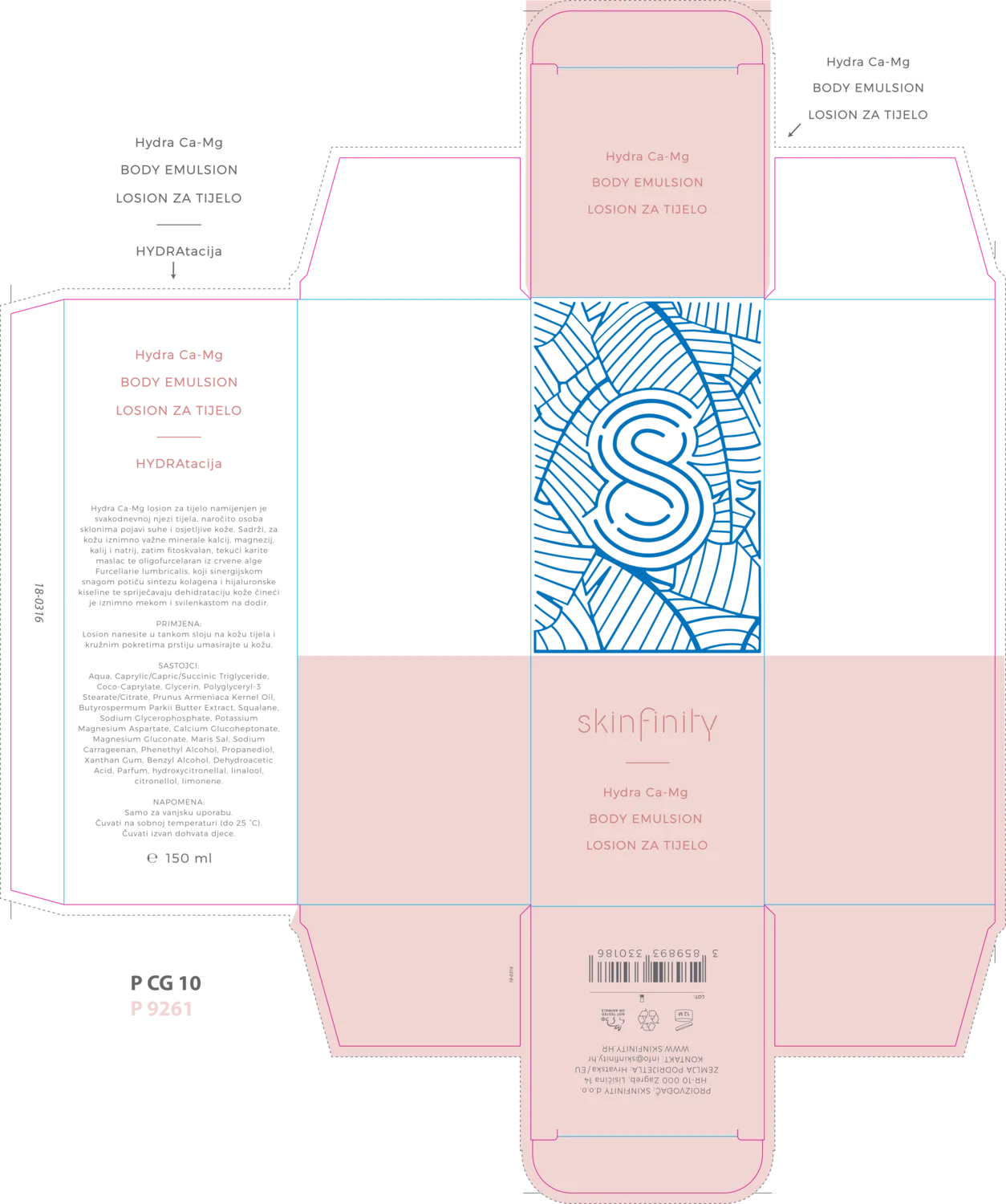
For the packaging we developed a system of soft pastel colours, one for each product line, paired with white boxes embossed with the fingerprint pattern.
Bottles, jars and testers follow the same principle: minimal white forms, rose gold caps and a small monogram, so the range feels calm and precise, yet personal.
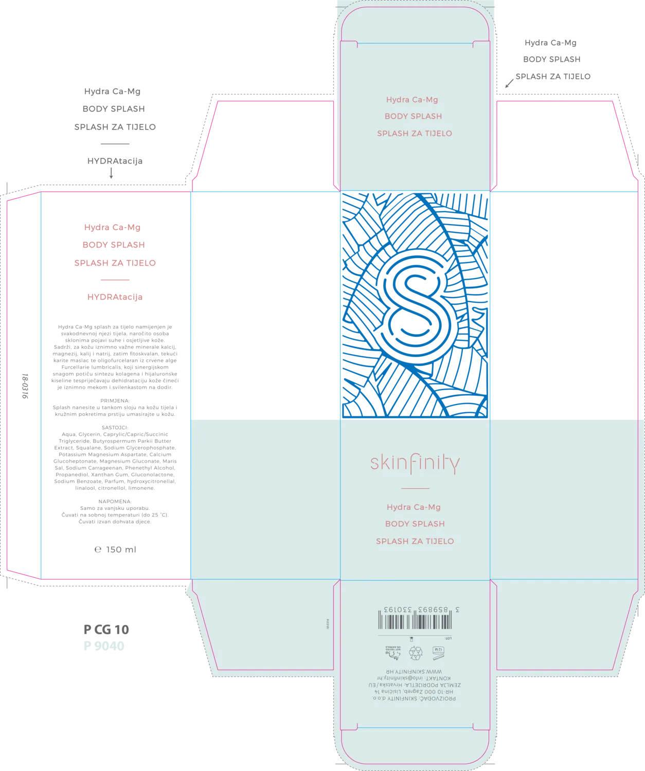
For the website we went in the opposite direction: a dark, editorial mood with widely spaced typography and large, cinematic imagery.
Words such as Ego, Hedonism, Skin, Nature, Science, Expression and Personal unfold one by one as you scroll, telling the brand’s story before the products appear, all the way down to the closing line: every skin has an ego.
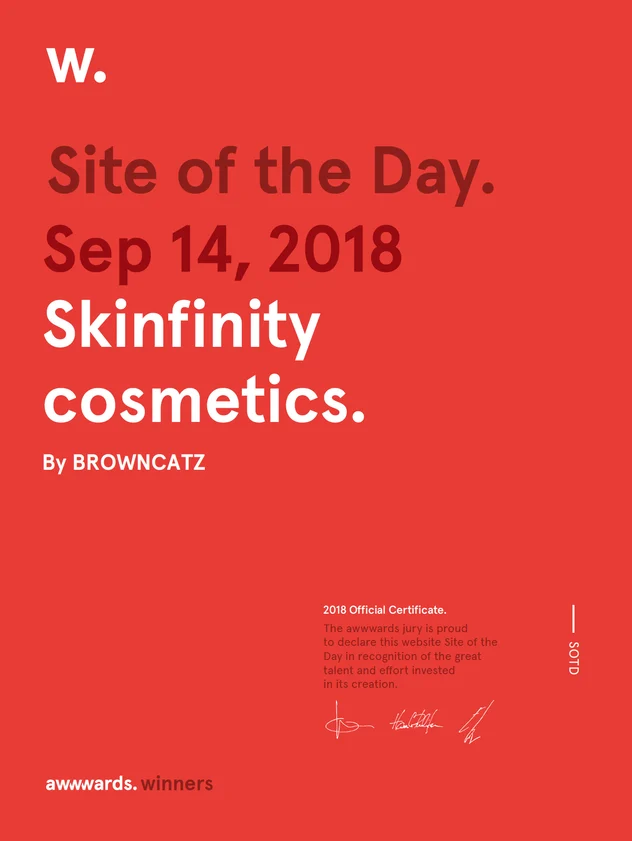
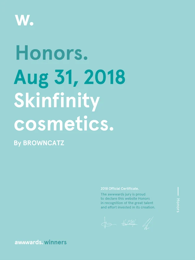
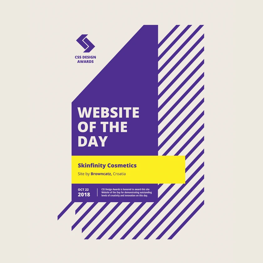



In 2018 the website won Site of the Day on Awwwards and Website of the Day, UI, UX and Innovation awards on CSS Design Awards.

Each collection and product has its own page, carrying the same mood through full-screen visuals, short videos and detailed product information.
Product names run vertically beside the packaging, with a short description, price and a Buy now button.