AboutKrtinić & Krtinić
law firm
law firm
Krtinić & Krtinić are two lawyers based in two different locations, working together.
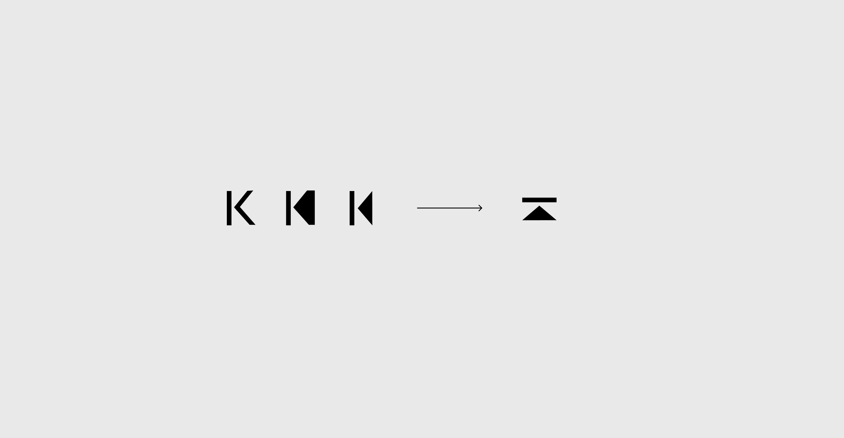
We wanted to make a very simple mark playing with the extraction from the letter K that is so prominent in their name - and made a very very simple icon for law - a basic principle of a scale.
Branding
The identity centres around a geometric symbol built from simple shapes.
Through a process of reduction, the letter K becomes an abstract mark that feels both distinctive and architectural.
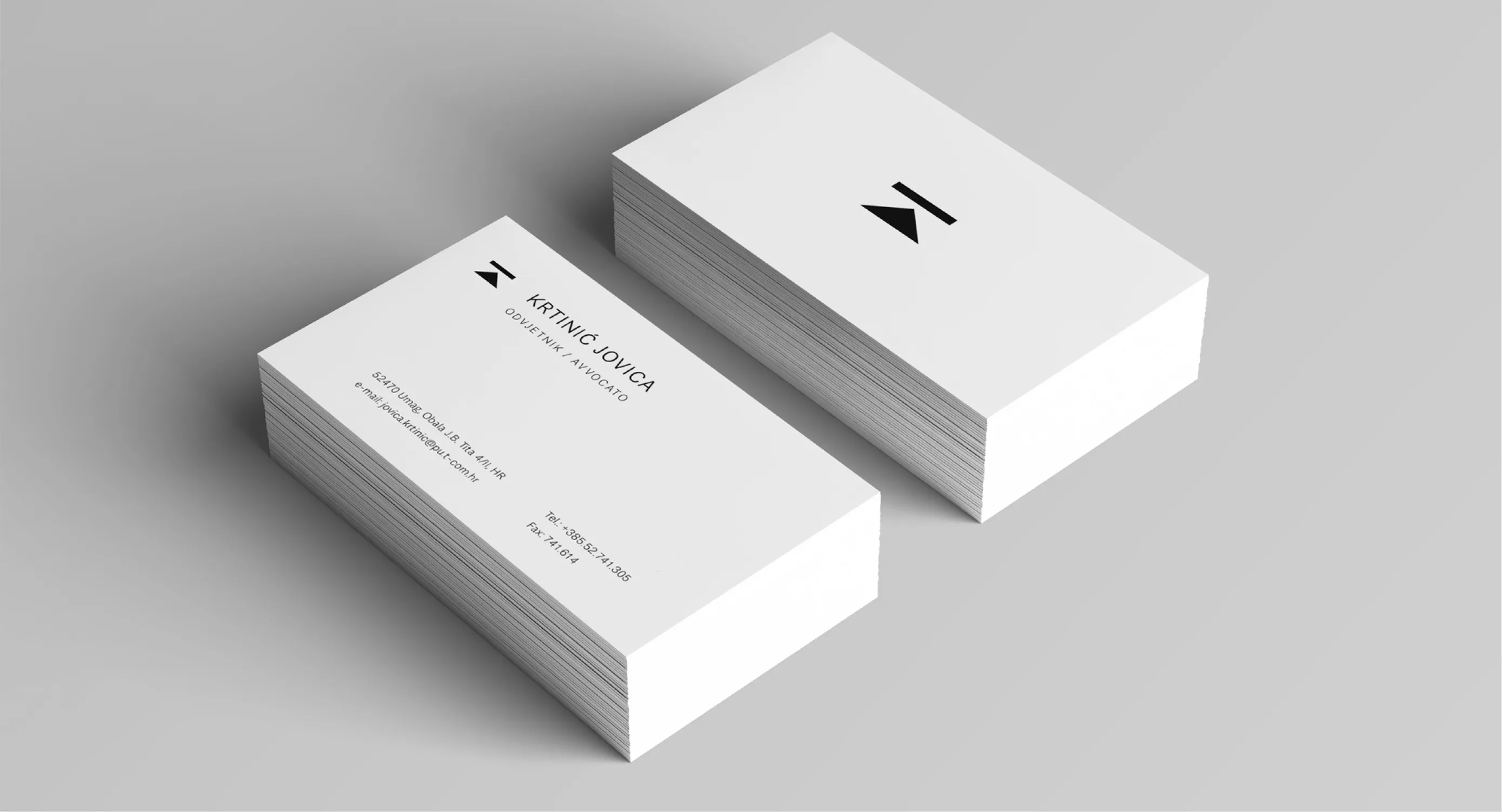
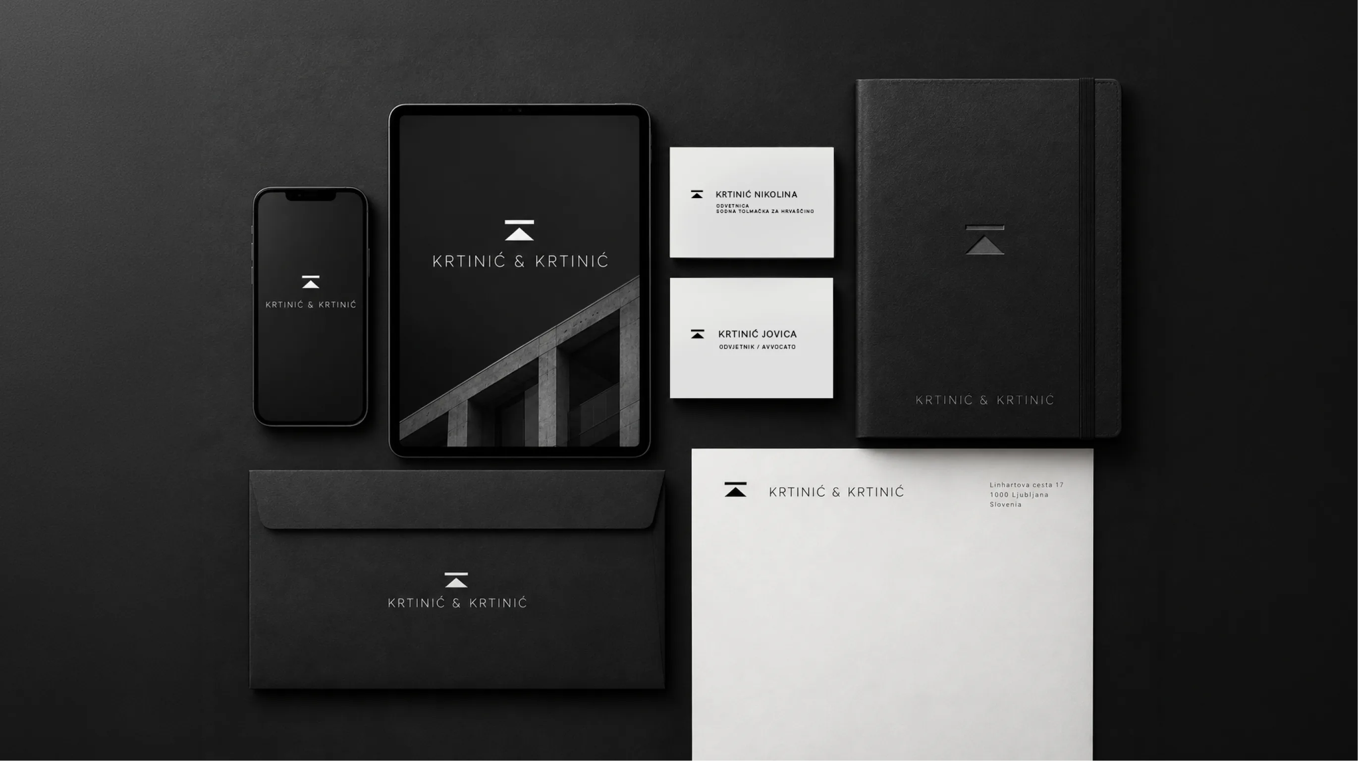
Paired with restrained typography and a monochrome palette, the symbol forms a flexible visual identity that works across different formats and applications.