Crazy Hills is an Austrian brand of all-natural fertilizers and biostimulants for all kinds of plants, from vegetables, fruit and herbs to flowers, medicinal crops and hemp.
The products are designed to work with the microorganisms and organic matter in the soil, without synthetics, and the company contributes 1% of every purchase to environmental and social causes.

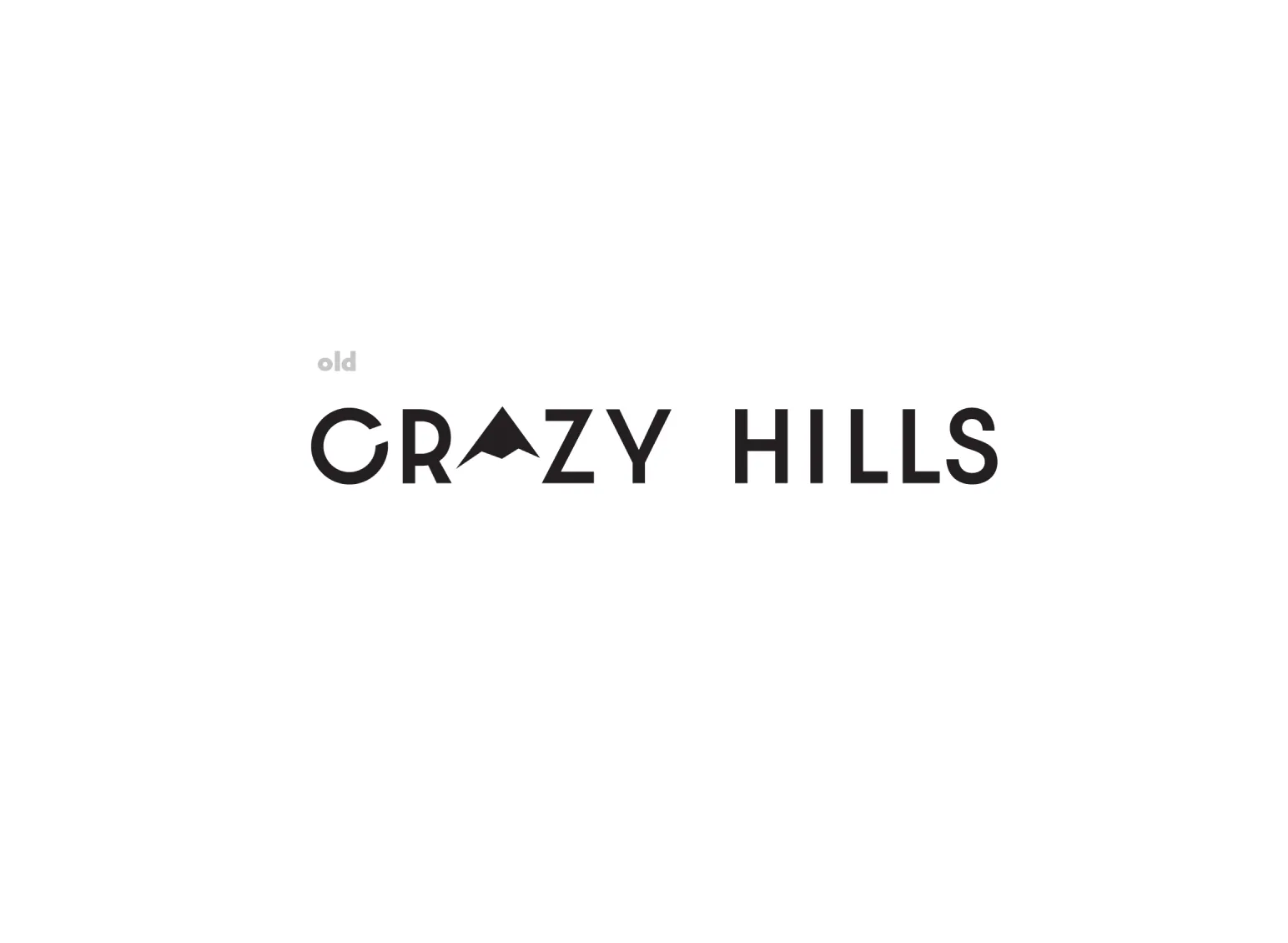
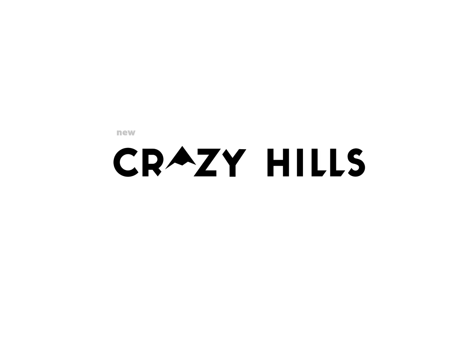
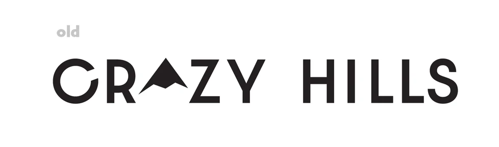
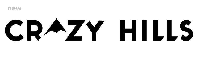


Crazy Hills already had a name with attitude, but the old logo didn’t quite match it. We kept the mountain peak in place of the A and redrew the wordmark as custom lettering: heavier strokes, tighter spacing and diagonal cuts that follow the exact slope of the peak. Even the C was redrawn to be perfectly symmetrical, so the peak, the letters and the angles read as one shape.
The same lettering became a small system of wordplays in which the peak always takes the place of the A, such as the “Grow Crazy” variant. The mountain on its own was turned into a separate sign for the Explorer Pack.
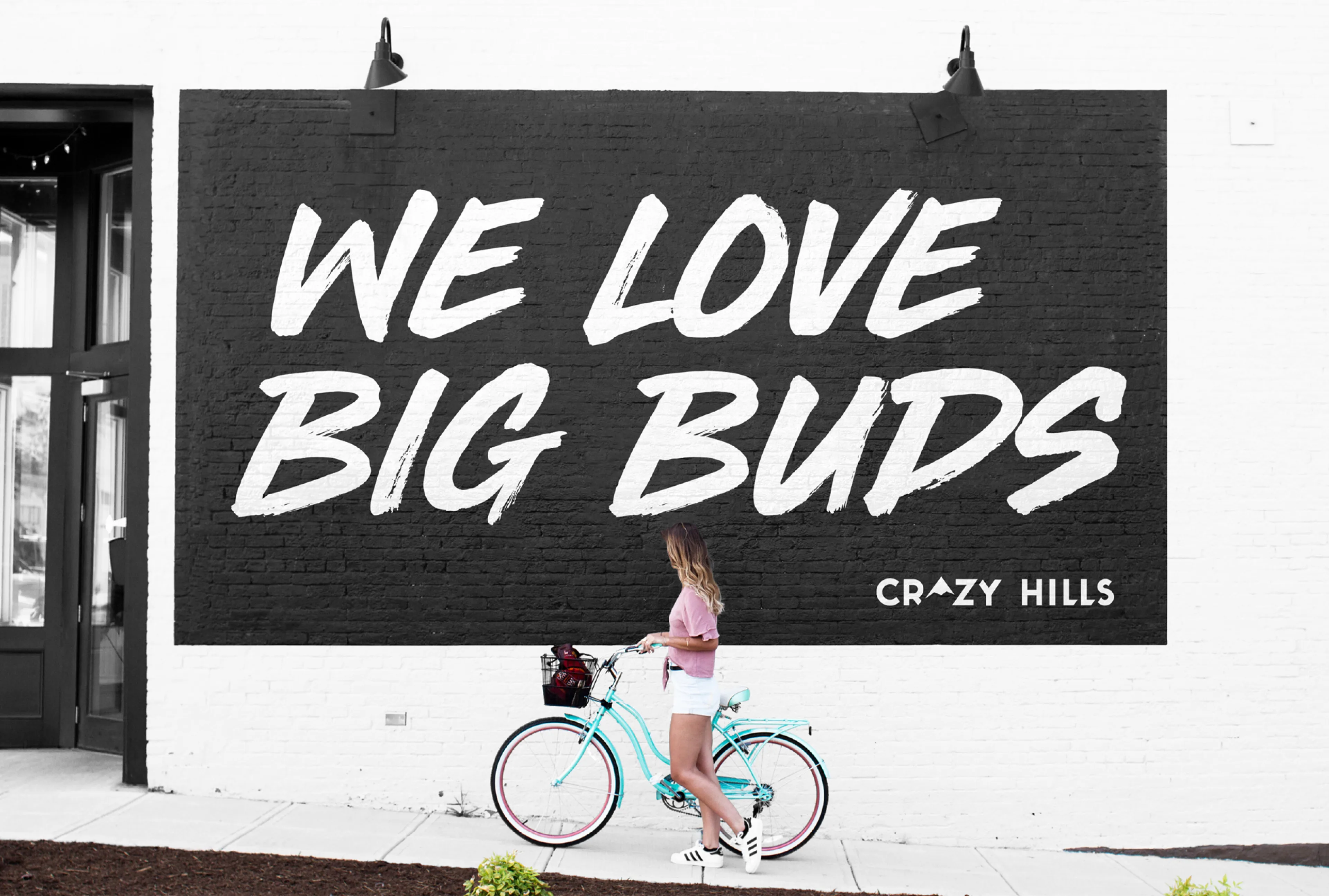

The brand speaks the way growers talk to each other: loud, direct and with a sense of humour. Hand-brushed headlines like “Screw it, let’s grow!”, “Grow crazy” and “We love big buds” run across the website, packaging and murals, set against black and the brand’s mint green.
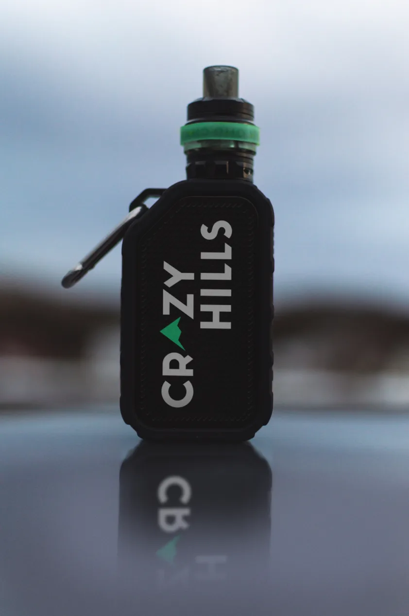
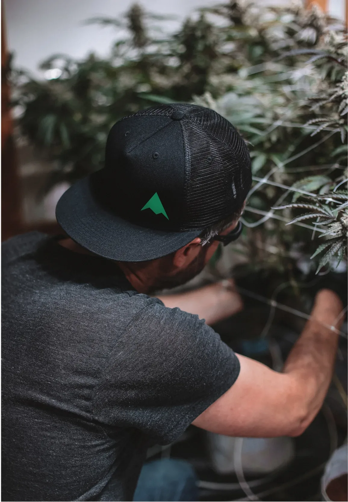
The same voice carries through a wide range of everyday applications: T-shirts and caps, tote bags, lighters, matchboxes and grinders, as well as flyers and practical printed guides such as growth and watering charts. Each piece is simple enough to work on its own, but together they build a recognisable world around the products.




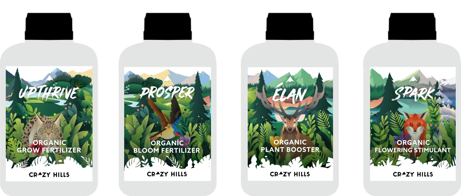
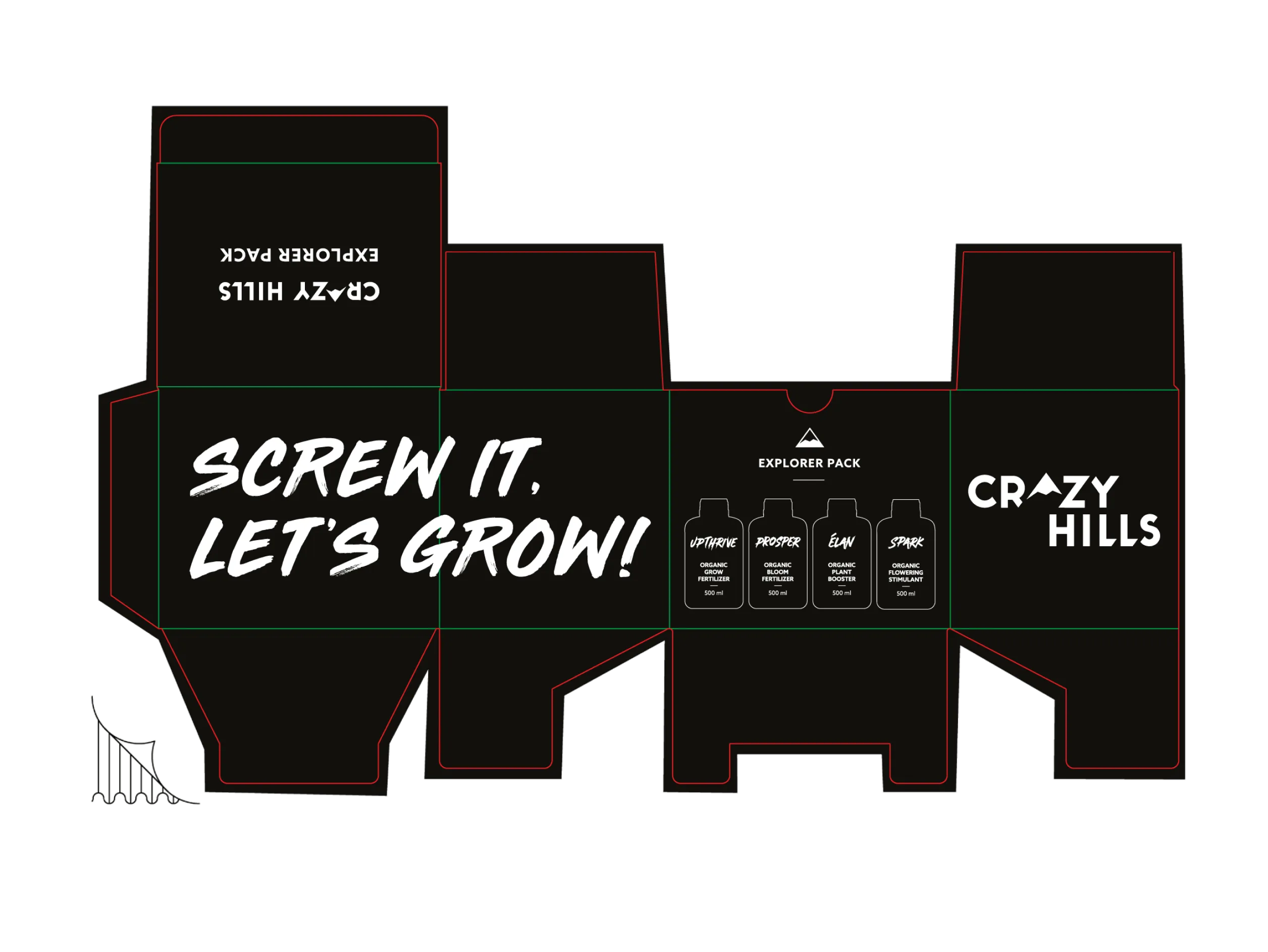
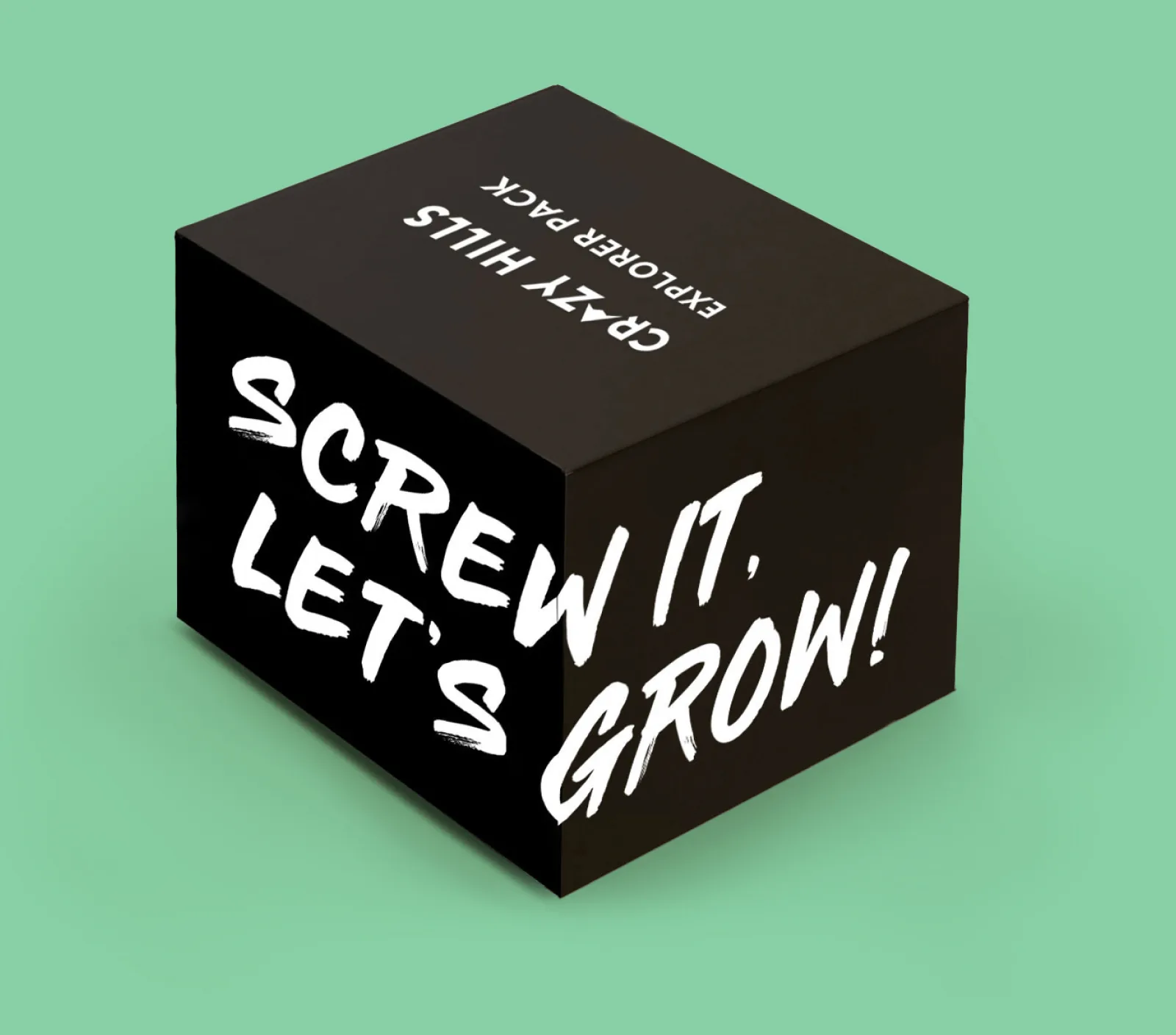
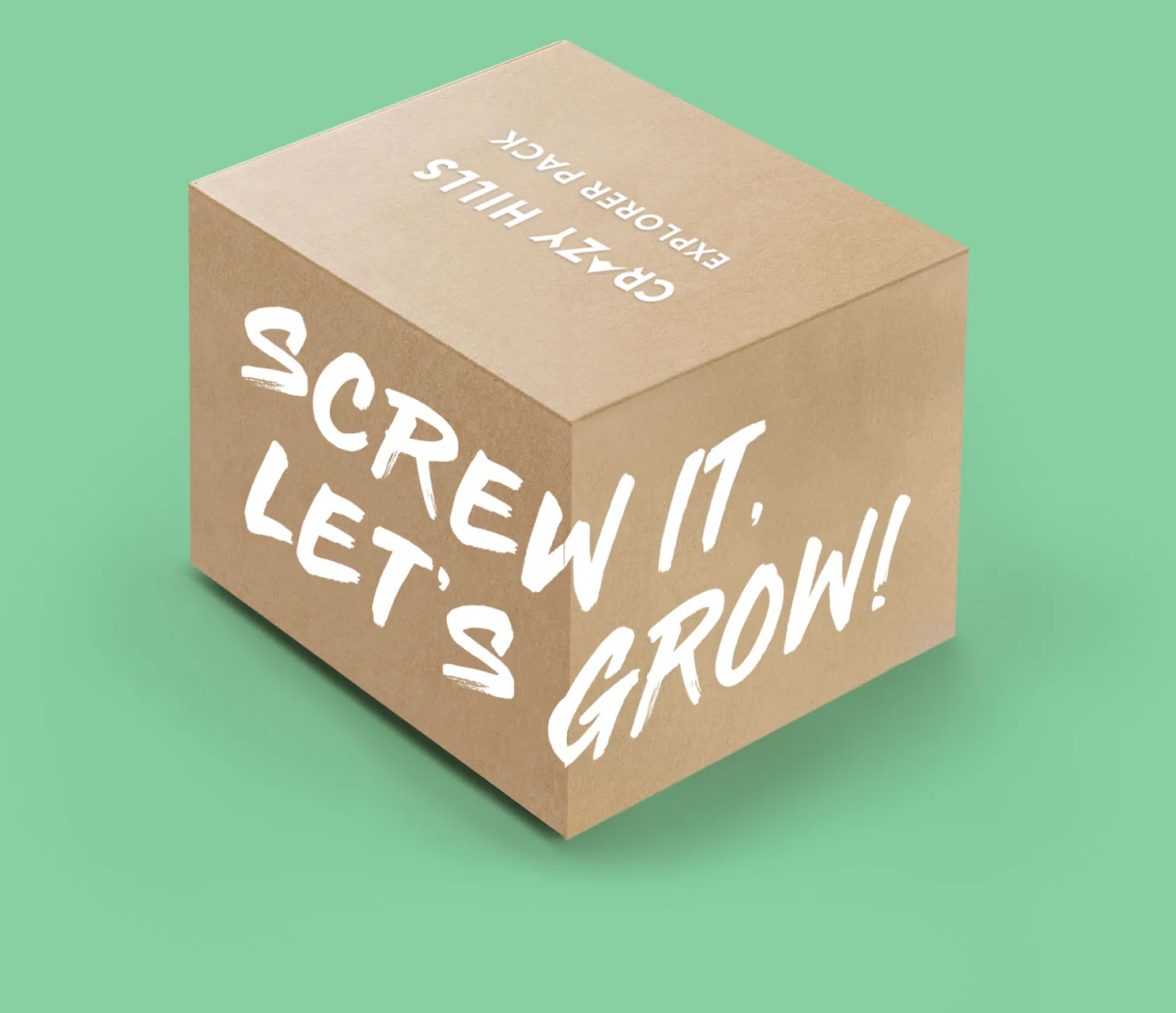
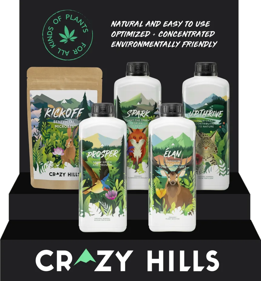
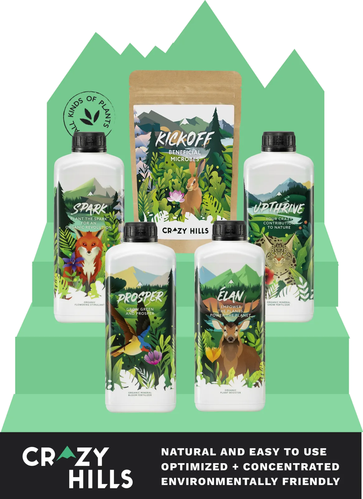
The product labels feature existing illustrations, each with a different animal in its own landscape. We adapted the labels to the new identity, bringing in the redrawn logo, and designed the Explorer Pack and the shipping boxes.
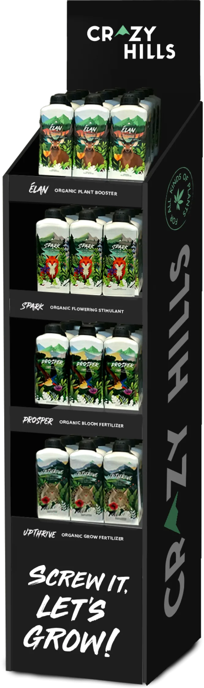
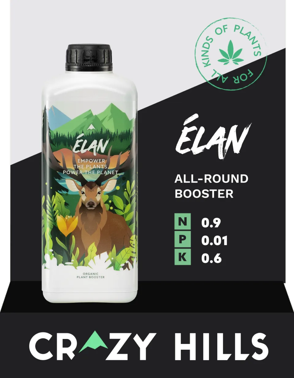
The displays shown here are just a few examples of a much larger body of work.
For every trade fair we designed product displays, posters, booths, tables, photo walls and video walls, and for stores we created displays, shop windows, window stickers and advertising, web banners, social media posts, reels and stories, keeping the brand recognisable wherever the products appear.

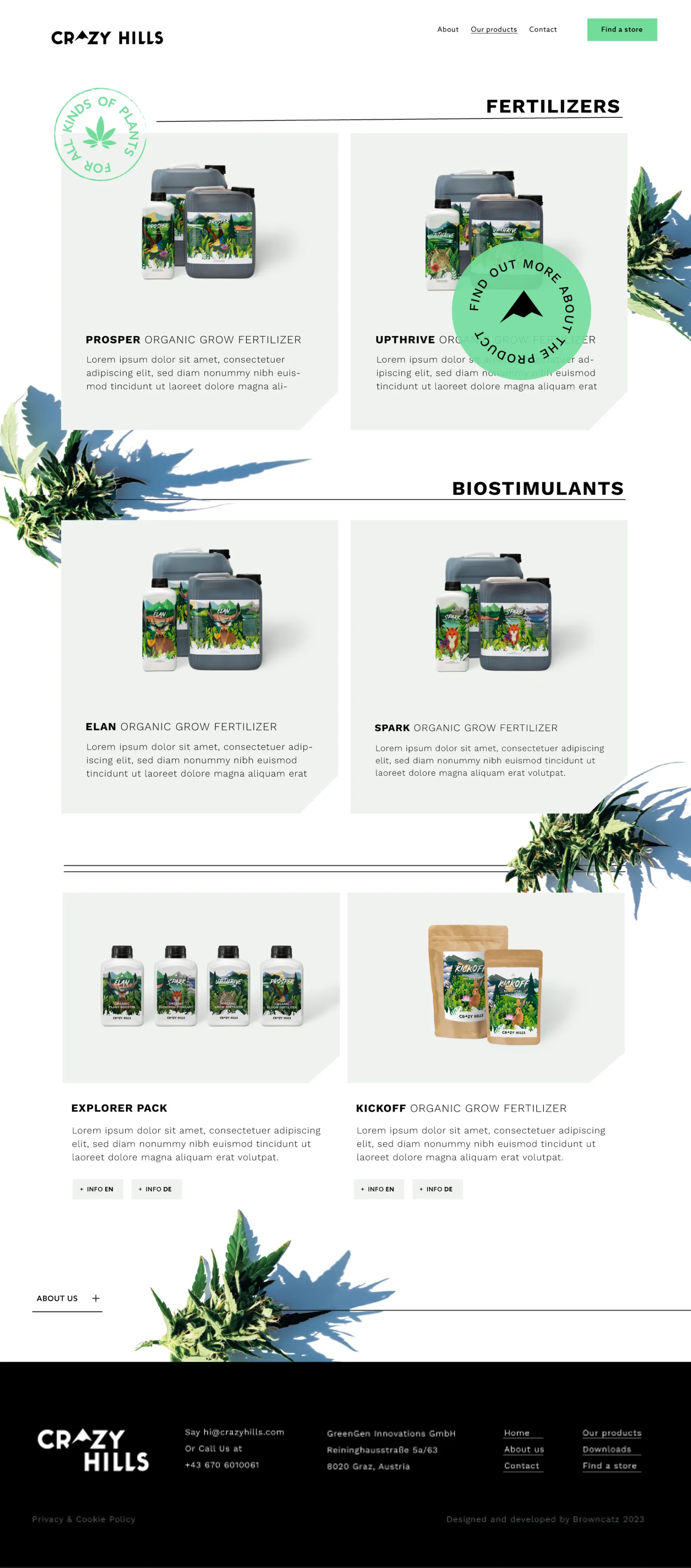
The website brings together the brand’s story, the product catalogue and a web shop. It opens with a scroll-driven hero: before the page moves on, every product in the range passes across the large lettering one by one, so the whole family is introduced in the first few seconds.
Further down, full-width slogans scroll between sections, and each product is presented with its label, its ingredients and the growing stage it is made for.
Hand-drawn hemp leaves, cut-out product shots and angled green panels keep the long homepage lively, while the copy stays short and informal, just like on the packaging.

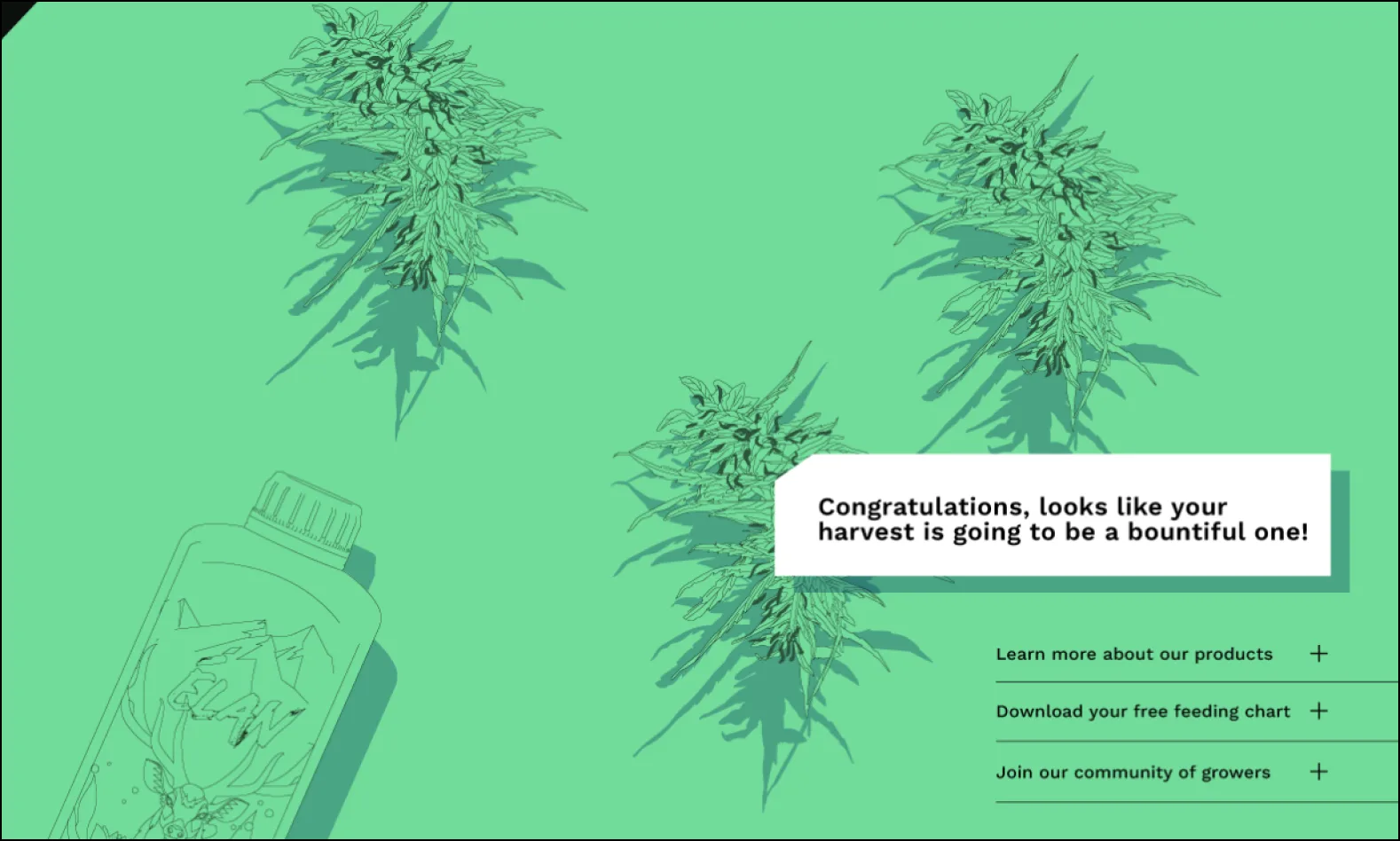
Just above the footer, the website ends with a small interactive game: visitors pick up a bottle of Crazy Hills fertilizer, water the buds and watch them grow.
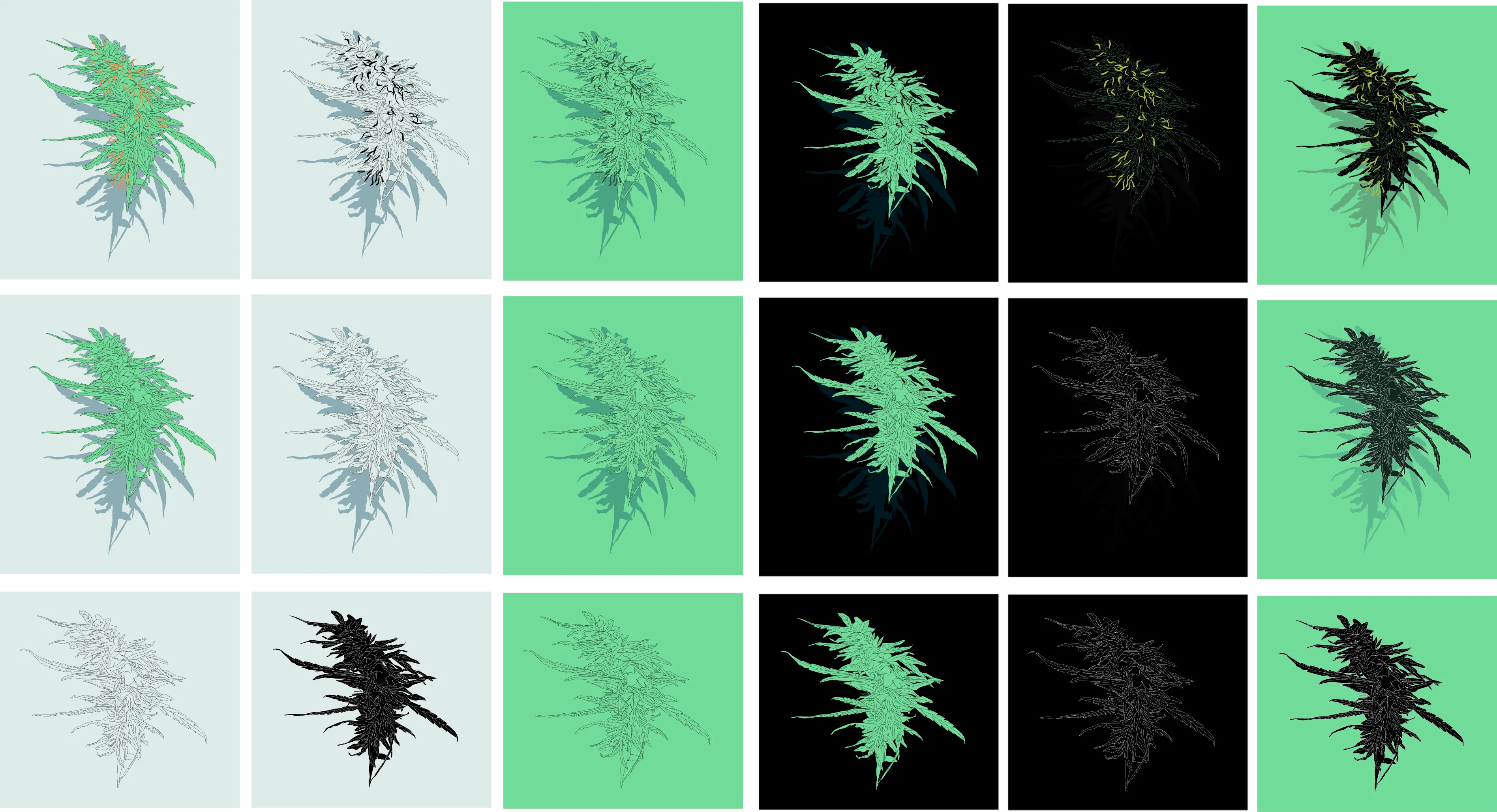
We drew the plants in several growth stages, from small sprouts to full, heavy buds, so every drop brings a visible change and the product’s promise turns into something you can play with.